A partial archive of https://score.community/ as of Monday March 04, 2024.

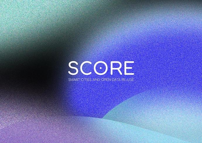
SCORE VISUAL IDENTITY READY - have a look

Mariechoetarp

Dear All,
As promised, here is a link to where you can find the SCORE visual identity presented at the WPL telco today. If you have any feedback or commentary on design and expression, please comment here or by the e-mail I’ve sent to you.

We hope you like it - we do!

Best, Marie

Mikkel

Hi Marie,

Nice job! I quite like the pixelated swirls and waves / rolling hills of slide 9 being somewhat spooky; the use of diverse and muted colours; and the understated target of the SCORE logo. Looking forward to the t-shirts as well :slight_smile:

Cheers,
Mikkel

JoranVD

Hey Marie,

I like it a lot! Very nice design. :slight_smile:

Grts,
Joran

Mariechoetarp

Thanks, @Mikkel. I thought it would also be nice to have these old school pens produced with a little roll-out explanation of what SCORE is produced.

pjppauwels

I like it. Did not see a target board in the O of SCORE, I honestly thought more of a nipple, maybe needs one more ring to distract semi-perverts like myself. Pixels and variations are nice. Subtitle under SCORE logo in light font is not really readable in some of the example, see image below.

brynskov

We tried to valid the most blatant bullseye :dart: references.

https://goo.gl/images/m7DkK2

https://goo.gl/images/Ut2aEG

https://goo.gl/images/ziD29L

https://goo.gl/images/L4F2PM

···

On 18 Jun 2018, at 21.13, Pieter-Jan Pauwels noreply@score.community wrote:

pjppauwels
pjppauwels

Pieter-Jan Pauwels

Regular

June 18
I like it. Did not see a target board in the O of SCORE, I honestly thought more of a nipple, maybe needs one more ring to distract semi-perverts like myself. Pixels and variations are nice. Subtitle under SCORE logo in light font is not really readable in some of the example, see image below.


Visit Topic or reply to this email to respond.

You are receiving this because you enabled mailing list mode.

To unsubscribe from these emails,
click here
.

pjppauwels

Thanks @brynskov to remind us it can always be a lot worse. :joy:
A good minor adjustment would be to invert the dot into a small circle.

Otherwise no real comments.

brynskov

*avoid

···

On 18 Jun 2018, at 22.12, Martin Brynskov noreply@score.community wrote:

brynskov
brynskov

Martin Brynskov

June 18
We tried to valid the most blatant bullseye :dart: references.

https://goo.gl/images/m7DkK2

https://goo.gl/images/Ut2aEG

https://goo.gl/images/ziD29L

https://goo.gl/images/L4F2PM


Visit Topic or reply to this email to respond.


In Reply To

pjppauwels
pjppauwels

Pieter-Jan Pauwels

Regular

June 18
I like it. Did not see a target board in the O of SCORE, I honestly thought more of a nipple, maybe needs one more ring to distract semi-perverts like myself. Pixels and variations are nice. Subtitle under SCORE logo in light font is not really readable in some of the example, see image below. [
17…


Visit Topic or reply to this email to respond.

You are receiving this because you enabled mailing list mode.

To unsubscribe from these emails,
click here
.

brynskov

:stuck_out_tongue:

···

On 18 Jun 2018, at 22.25, Pieter-Jan Pauwels noreply@score.community wrote:

pjppauwels
pjppauwels

Pieter-Jan Pauwels

Regular

June 18
Thanks
@brynskov
to remind us it can always be a lot worse. :joy:

A good minor adjustment would be to invert the dot into a small circle.

Otherwise no real comments.


Visit Topic or reply to this email to respond.

You are receiving this because you enabled mailing list mode.

To unsubscribe from these emails,
click here
.